Currently Empty: $ 0.00
Art & Design
Color Psychology in Branding: Selecting the Right Colors for Your Business
Color is an ever-present force in our world, profoundly impacting how we perceive things. In graphic design, choosing the right color palette is crucial for branding – it sets the tone, evokes emotions, and creates a lasting impression of your business.
Why is Color So Important in Branding?
Think about some of the world’s most recognizable brands: Coca-Cola’s vibrant red, McDonald’s golden arches, and Tiffany & Co.’s signature blue. These colors instantly bring the brand to mind. Color is a powerful tool for brand recognition and recall.
But color goes beyond recognition. Colors have well-established psychological associations. Red is often seen as bold and energetic, while blue is associated with trust and security. Green evokes feelings of nature and growth, while yellow is linked to optimism and happiness.
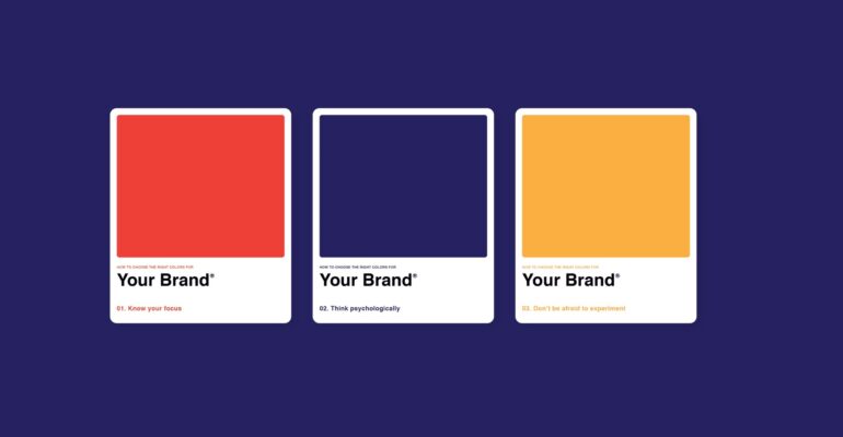
By carefully selecting your brand colors, you can communicate your brand values and personality to your target audience. Imagine a children’s daycare center using a palette of black and gray – it wouldn’t feel very inviting, would it?
Choosing Your Brand Color Palette: A Step-by-Step Guide
Crafting the perfect brand color palette requires careful consideration. Here’s a step-by-step approach to guide you:
- Understand Your Brand: Delve into your brand’s core values and target audience. What message are you trying to convey? Who are you trying to reach?
- Research Color Psychology: Educate yourself on how different colors can influence emotions and perceptions. Explore resources on color psychology to understand the symbolic meaning behind various colors.
- Seek Inspiration: Draw inspiration from successful brands in your industry or complementary fields. Analyze how established brands leverage color palettes to achieve their branding goals.
- Limit Your Palette: For consistency, stick to 2-3 main colors. You can incorporate additional accent colors for variety, but avoid overwhelming your audience with a rainbow.
- Test and Refine: Experiment with different color combinations. Don’t be afraid to get creative! Gather feedback from colleagues and potential customers to gauge their initial impressions.
Remember: There’s no one-size-fits-all approach. The key is to choose a palette that reflects your brand’s unique identity and resonates with your target audience.
Bonus Tip: Consistency is Key!
Ensure brand color consistency across all mediums – print, digital, and physical products. This reinforces brand recognition and strengthens your brand image in the minds of your customers.